MeeGo Twitter App
Before Nokia adopted Windows Phone as their primary platform, it released the Nokia N9 in 2011. It was the first phone to move away from Symbian and towards a new, modern, platform based on MeeGo, a Linux-based open source operating system. To prepare for the release of the N9, I paired up with a visual designer to design and specify a Twitter application for the MeeGo platform.
Working as a hybrid product manager and interaction designer, I specified the feature set, created the information architecture and wireframes, and worked with the visual designer to create pixel-perfect specifications to be handed off to an engineering team.
One challenge with this project was that the MeeGo platform was under heavy development while the individual design teams were building their respective apps. Even concepts as basic as hierarchical navigation and multitasking were still rapidly changing while we worked on the app.
To help mitigate this, we were in close contact with the platform design team in Helsinki, giving feedback on their updated toolkits as they delivered them. In addition, by working ahead of them, we were able to uncover ambiguous areas and conflicts in the platform that we could then report back to them to be addressed.
One of our early goals with the project was to allow the Twitter branding to shine through, but still have the app feel like a first-class citizen of the MeeGo platform, rather than just an iPhone or Android port. Fortunately, the talented visual designer I paired with had a strong background in branding, and he was able to push the app towards a beautiful co-branded solution. His work was highly-regarded inside the company and used as a model for several other apps.
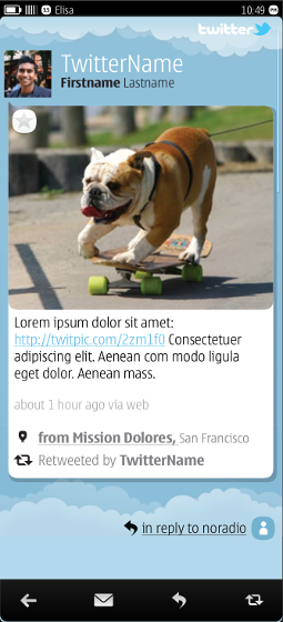
Another key goal of the project flowed from one of the overall MeeGo design principles: “content first, chrome second.” To that end, we pushed ourselves to put the user’s content front and center whenever we could, letting metadata and controls become secondary. This was particularly fruitful in the “single Tweet” view, where we designed an executed an in-line media viewer (including images, music and maps). We felt this was a big improvement over other Twitter clients of the time that typically required the user to click the media link to open in a new window.
The development team for the app was in Finland, which meant that the designs and product specifications needed to be well-documented. In addition to the wireframes I created, I also documented the app’s architecture and flows between screens. Finally, I listed and called out all common components that were used throughout the app. This not only helped the engineers in their work, but also allowed the app’s visual designer to just specify these components once for repeated use.


