Stride Drive (Android)
Stride Health helps the self-employed get the same kind of benefits that people working in larger companies enjoy. When founded, the company focused on health insurance, but has since expanded into financial benefits. These financial benefits include helping people with their taxes.
As part of that, we offer Stride Drive, a free mileage and expense tracking app for the self-employed. Customers use it to track their deductible work miles and expenses, then export an IRS-ready report at the end of the year.
As the lead designer on Stride Drive, I designed a new Android app from scratch that more than doubled our addressable market.
When I joined Stride in 2016, they already had released Stride Drive on iOS. The app had a small but dedicated group of users and was growing fast. But despite the promising signs, our internal reporting was showing that 60% of our target audience was on Android devices, and therefore out of reach.
We began work planning an Android version of the app. I worked closely with my PM to prioritize features and identify areas for improvement. Speed to market was our top priority, so we had to be ruthless about cutting features that didn't need to be in an MVP. We also decided to limit improvements to increasing the efficiency of the app's architecture and existing features, rather than introducing entirely new features. By involving the engineering team early, we were able to make key tradeoffs and avoid scope creep.
Starting early on, we broke the project into phases, rather than a simple "MVP" vs "add later" grouping. This phased approach turned out to be a key strategy to get executive buy in on the project. It changed conversations from, "Why isn't this feature being built" to "when will this feature ship?" I created a color-coded feature roadmap to guide this discussion:
Once we landed on a proposed feature set for the release MVP, I mapped out how the initial group of features would fit into the app. This confirmed that the initial feature set was indeed a viable product and that we didn't accidentally cut any key features that kept the whole app together.
When looking for opportunities to improve the Android app, we compared it to the existing iOS app. We identified two key areas that needed improvement:
App navigation: the architecture of the iOS app was built in piecemeal and this was an opportunity to reorganize the app with the benefit of hindsight and knowing what features we needed to include
Efficiency: key features like adding expenses were hidden behind separate pages and therefore took extra taps to complete
You can see the first three tabs of the iOS app below. The fourth tab is the Benefits tab, where we cross-sell users to our health, dental, and vision insurance products.
When reviewing our product analytics, we noticed that users rarely switched tabs off the first "Drive" tab. This meant they weren't seeing the list of deductible expense categories, and potentially missing out on even more tax deductions. Not only that, the "Drive" tab was only useful when actually driving -- otherwise it had no useful information.
The second, "Expenses," tab allowed users to add deductible expenses to their account, but users could only see the expenses that they added on the third "Reports" tab. That meant that as they added expenses, there was no feedback that their expense was actually contributing to their total tax deduction.
I set to work to address these issues by reimagining the core architecture of the app. After creating some initial concepts, I set out to validate them with users. The problem? Because we were only available on iOS, I didn't have a pool of Android users to draw from to evaluate these new concepts.
To solve this, I leaned on my guerrilla user research skills. I walked outside and hired an Uber, then offered to let the meter run while I showed them a few low-fidelity wireframes to get their feedback. I performed several rounds of research like this, improving the designs each time. I evaluated what (if any) tabs to include, and where to place the key actions of recording miles and adding expenses.
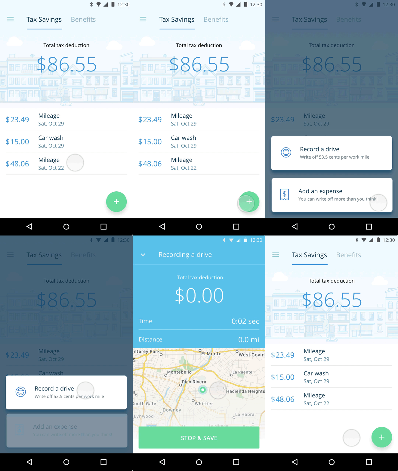
In the end, there was a clear winner with users: the third option, where there were only 2 tabs, and the key actions were placed under the bottom right Floating Action Button (FAB). The two tabs were simply Tax Savings and Benefits. This helped reinforce the twin purposes of the app right off the bat and helped tell the larger Stride story around providing a suite of benefits to self-employed workers.
With the key actions of adding miles and expenses both placed under the FAB, expenses were elevated to a first-class feature in the app. Furthermore, by making the "Tax Savings" tab the home screen, all deductions immediately show up as soon as they're added by the user.
Results
Since being released, Stride Drive for Android has been a huge success for Stride. It contributed to overall year-over-year improvements of 6x growth, 4x monthly active users, and has maintained an NPS score of 80.


